Controlling use case
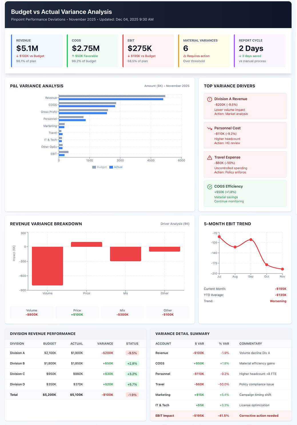
Budget vs Actual Variance Analysis (Management Reporting)
Pinpoint where and why actual performance deviated from the plan, in minutes rather than days.
- Easy setup, no data storage required
- Free forever for core features
- Simple expansion with additional credits
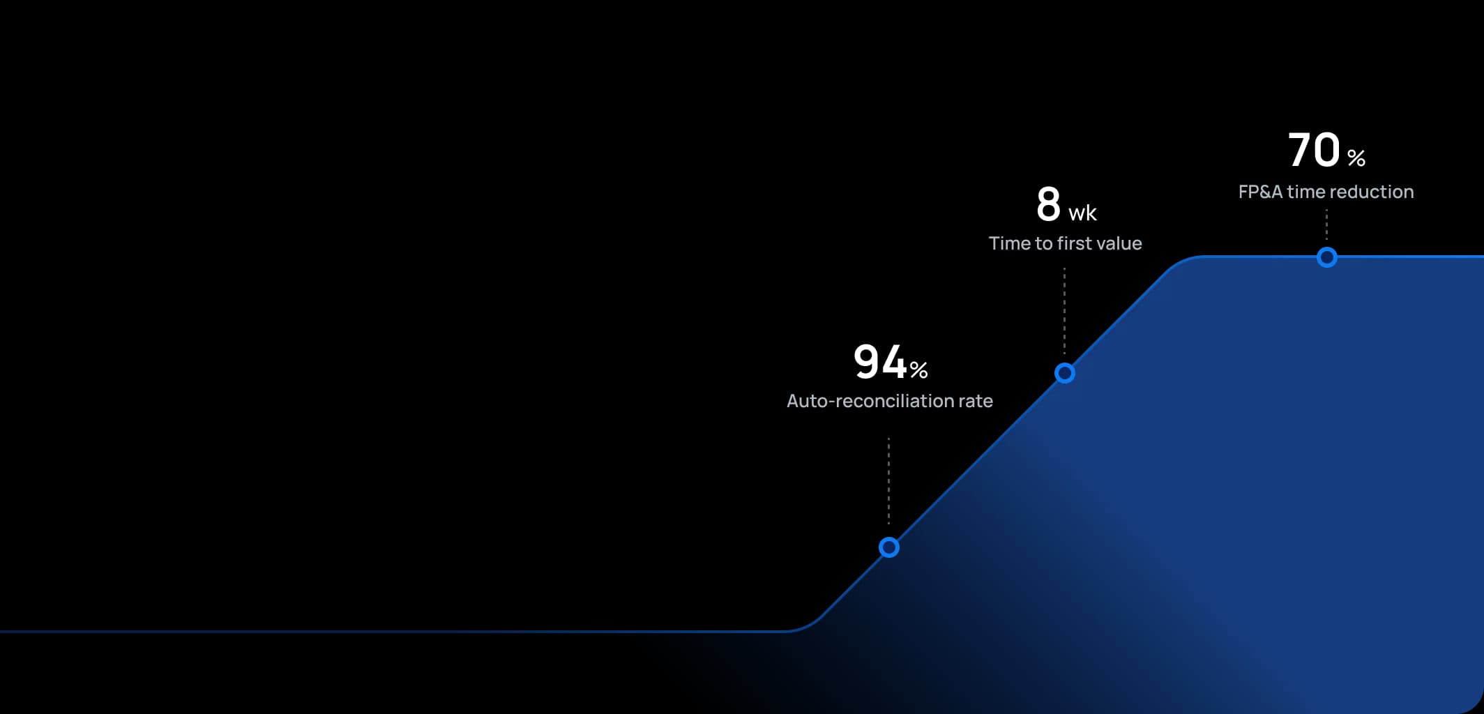
Time to first value
Man-days saved per year
Faster than spreadsheets
Dashboard shown is a conceptual example. Keboola integrates with any BI or analytics platform.

Dashboard shown is a conceptual example. Keboola integrates with any BI or analytics platform.
Overview
What this use case actually does.
Plug into what you already run
Your ERP, CRM, planning tools, warehouse — connected without replacing anything.
Governed, not glued together
Versioned transformations, lineage, and audit trail — every number traces to source.
Live in 8 weeks, owned by your team
Not a black box — your team configures, extends, and runs it from week one.
Pinpoint where and why actual performance deviated from the plan, in minutes rather than days.
Finance teams typically spend 3-5 days each month manually compiling variance reports in Excel, leaving little time for the analysis that actually drives business decisions. This use case provides systematic analysis of variances between budgeted figures and actual results (monthly, quarterly, YTD), automating what controllers and FP&A analysts previously did manually. Keboola automatically collects actuals and budget data, calculates variance amounts and percentages, and can break down variances by drivers (price vs volume, mix, yield) when relevant data is integrated. It presents information in clear reports or dashboards highlighting major deviations, enabling finance teams to focus on "the story behind the numbers" – explaining causes and deciding actions – rather than wrestling with data preparation. The result: variance insights available on Day 2 instead of Day 5, allowing proactive management rather than reactive explanations.
The pain
Where the spreadsheet breaks.
These are the problems your team runs into every month — without a unified data layer, every workaround eventually fails.
Slow, Manual Reporting Cycles
Organizations prepare variance analysis via Excel after retrieving actuals from ERP and budgets from planning systems – a process taking days each month to organize and format. By the time management receives the analysis, it's already stale and the team has minimal time to investigate root causes
Inconsistent Explanations
Without structured approaches, variance explanations are ad-hoc and inconsistent across departments. One manager reports variance causes differently than another, making roll-ups and comparisons difficult.
Overlooking Key Variances
In mountains of data, manual processes cause teams to miss significant variances in smaller departments or specific accounts until too late. They focus on high-level totals and don't notice Travel Expense running 50% over budget in one division, signaling uncontrolled spending.
Reactive Management
Slow, superficial variance analysis keeps organizations always reacting to past results instead of proactively adjusting. If revenue shortfalls aren't properly analyzed (volume? pricing? product mix?), corrective actions like marketing pushes or pricing changes won't be timely or properly targeted.
What Keboola does
What Keboola actually delivers.
No magic, no replatforming. Just connectors, governed transformations, and outputs your team owns from day one.
Timely, Automated Variance Reports
Keboola fetches actuals and budgets (or latest forecast) as soon as books close and automatically computes variances at any level of detail (company, division, department, account). Reports are available the morning after close, allowing controllers and managers to start reviews immediately. This speed shifts time from data preparation to root cause analysis.
Smart Highlighting of Material Variances
The platform applies intelligent rules (highlight variances >X% and >Y amount) to direct attention where it matters. It ranks variances by profit impact, showing "these are the top 10 drivers of overall variance this month." For instance, it may reveal that 80% of total company EBIT variance comes from just 2 factors: lower sales in Product Line A and higher raw material costs in Plant B.
Driver-Based Decomposition
When data is available, Keboola performs advanced variance analysis splitting revenue variance into components: volume variance, price variance, mix variance. Or COGS variance into material price vs usage vs yield. This traditionally manual calculation becomes automated by pulling operational data (units sold, standard vs actual costs).
Collaboration & Commentary Platform
Keboola serves as a single place where variance commentary is collected alongside numbers. Department managers or controllers enter explanations for their areas, which aggregate into management reports. Because everyone views the same variance figures (no separate spreadsheets per department), commentary is coherent and directly tied to data. This enforces discipline like providing reasons for variances over X%.
Connectors
Out of the box. No replacements.
This use case typically uses 8 connectors. Keboola ships 700+ more for the long tail.


Tangible deliverables
What lands in your team's hands.
Each role gets the format and the detail they need — already configured. Not slideware.
Division Manager
Tailored variance dashboard showing division revenue, expense, and profit vs budget with color-coded variances (red negative, green positive). Breaks down major line items with waterfall charts for EBIT showing how variance builds from revenue through key expenses. Highlights critical issues: "Consulting Revenue -15% ($200K below plan)" or "Personnel Cost +10% ($100K over plan)" so they immediately know where to focus in review meetings.
FP&A Analyst
Comprehensive variance report for the entire company: tables for each P&L line at consolidated level with columns for Budget, Actual, $ Variance, % Variance, and prior-year context. Narrative section compiles all division explanations into coherent story using system-provided templates. Bridge analysis charts (waterfalls) show how you get from budgeted profit to actual profit via various variances. This output feeds management reporting and board decks.
Controller
High-level flash report focusing on major variances across the company, available before commentary is complete. Includes KPI variances (headcount vs budget, production volume vs plan) if integrated. Serves as controller's checklist of "which variances need thorough explanation this period" and spots anomalies requiring immediate attention – like a huge variance in one region's expenses prompting an immediate call to that manager.


Talk to a
real human.
No bots, no SDR call sequence. A solutions engineer who runs use cases like this every single day.
Questions & answers
Things people always ask.
Everything your team, IT, and procurement will want to know — up front.